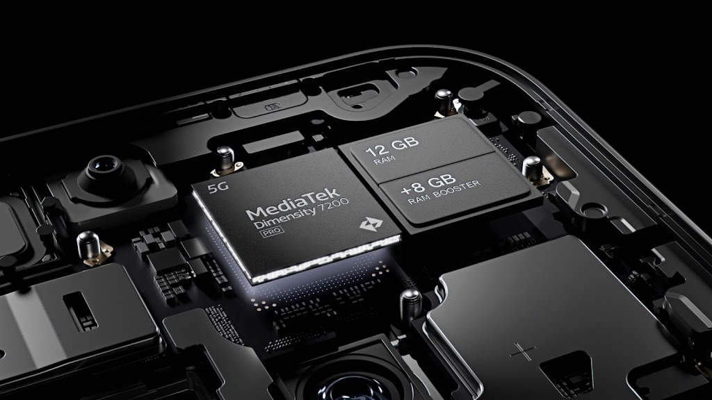
The Nothing Phone 2a is the latest smartphone from the company that aims to bring transparency and simplicity to the mobile industry. The phone is set to launch on March 5, 2024, and will compete as a mid-range device with a 5,000mAh battery, a 120Hz display, and a MediaTek Dimensity 7200 Pro processor one that was specifically tweaked for the device, you can check out my other article on the device here.
The phone also features the signature transparent back and aluminium frame of its predecessor, the Nothing Phone 2, but with a few tweaks. The most noticeable change is the camera module, which is now centred and surrounded by three Glyph lights that can be customized to display different effects and notifications as usual.
While many people may find the design of the Nothing Phone 2a appealing and unique, I personally have some reservations about it. Don’t get me wrong, I think the phone looks great and modern, I love it, and I appreciate the company’s vision of creating a minimalist and elegant device. But there is something that bothers me about the camera module, and I think others may not share my opinion.
First of all, I don’t like the centralised camera module. I think it makes the phone look unbalanced and awkward, especially when holding it in landscape mode. I prefer the camera module to be placed on the top left corner of the phone, as it is more aesthetically pleasing and ergonomic. I also think that the centralised camera module may interfere with the wireless charging or the NFC functionality of the phone, as it may block the coils or the antenna but I’m pretty sure Nothing dealt with that like the great designers they are.
Secondly, I don’t like the horizontal orientation of the camera module. I think it makes the phone look wider and bulkier than it actually is, and it also reduces the space for the Glyph lights. I think a vertical orientation would have been better, as it would make the phone look slimmer and taller, and it would also allow for more Glyph lights to be added, which would enhance the user experience and the customization options.
These are my personal thoughts on the Nothing Phone 2a design, and I understand that others may not agree with me. I know that design is a subjective matter, and that different people have different preferences and tastes. I also know that the company has put a lot of effort and research into creating the phone, and that they have a loyal fan base that supports their products. I respect their choices and their opinions, and I don’t mean to offend anyone with my criticism.
I still think that the Nothing Phone 2a is a good phone, and that it has a lot of potential to succeed in the market. I’m curious to see how it performs and how it compares to other mid-range phones. I’m also interested to see how the Glyph Interface works and what it can do. I may even consider buying the phone myself, as I am a huge fan of the Nothing Phone 1 and Phone 2 but only if I can get over my dislike of the camera module.
What do you think of the Nothing Phone 2a design? Do you like it or not? Let me know in the comments below.
